Studio notes, methods, and materials
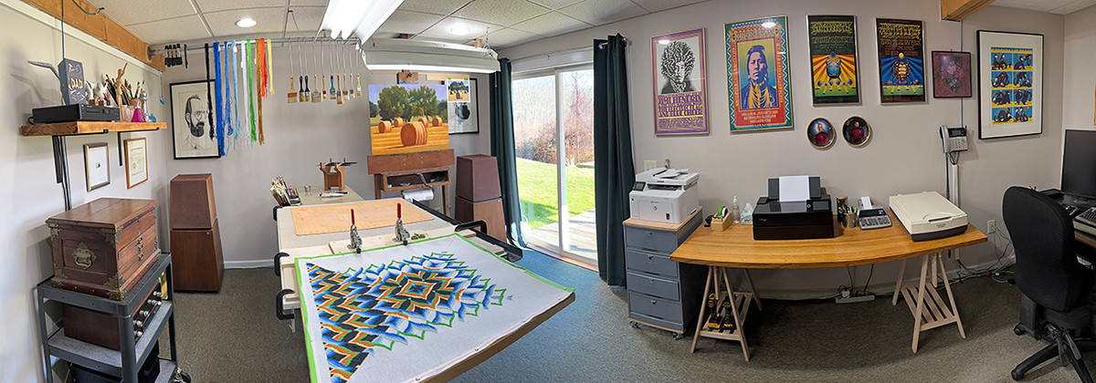
My home studio includes a painting work area, digital image editing work area, bookcases, work tables, and studio storage. The ceiling height is only 8 feet so most all of the large paintings are 24 inches or so in height. Its warm, comfortable, well lit, with large sliding doors to the back yard, adequate ventilation and provides all the space I need to paint and do my digital image editing and photo restoration work.
Surface and preparation – Landscapes
I prefer to paint on prepared panels, which I make myself using 1/2-inch Trupan Ultralight MDF (Medium Density Fiberboard). These panels are 1/3 the weight of commercial MDF, never warp and require no cradling. I purchase them in 4 x 8 sheets and cut them to size on a table saw. I use Utrecht Professional Acrylic Gesso to prepare the surface for painting. It is by far a superior gesso, thick and dense, self-leveling evenly with each coat. With an inexpensive 4-inch hardware store chip brush I apply the first coat of gesso using long random brushstrokes as I prefer a somewhat textured surface – no sanding is necessary. After drying for several hours or overnight (outside in direct sun less than one hour) I apply a second coat the same way. Unlike most other commercial gessos, Utrecht Professional Acrylic Gesso is non-absorbent and ideally suited to my paint and wipe-out method of creating an underpainting.
Surface and preparation – Florals
Although I occasionally paint on stretched and primed linen canvas, I prefer to paint on mounted linen panels, which I make myself using 1/2-inch Trupan Ultralight MDF (Medium Density Fiberboard). These panels are 1/3 the weight of commercial MDF, never warp and require no cradling. I purchase them in 4 x 8 sheets and cut them to size on a table saw. To these I attach high quality portrait grade Belgian linen using Lineco Neutral pH Adhesive applied with a 6-inch high density foam roller, one coat to attach and another coat on top to saturate the linen. After drying overnight the panel is sanding with 150-grit sandpaper. Next, I apply a coat of Gamblin Oil Painting Ground (alkyd resin, titanium dioxide, and calcium carbonate) with an inexpensive 3-inch disposable brush thinned with a bit of solvent to make it easier to apply, and then go over it with a 6-inch high density foam roller, leveling out the ridges from the brush marks until the surface is consistently smooth. After drying outside in direct sun for one day (one week or longer indoors), I sand with 150-grit sandpaper. The process is then repeated for the second coat. On panels only (no mounted linen) I apply two coats of Premium Ultra Pure white 100% Acrylic Latex house paint, sanding in-between coats. After drying overnight I apply two coats of Gamblin Oil Painting Ground finishing off as described above. Check out my YouTube video demonstrations to see the process from start to finish, and more.
Drawing and transfer
I no longer do any detailed drawing, sometimes an underpainting using Raw Umber, Transparent Red Iron Oxide or Quinacridone Magenta. But, for many years I would transfer my reference image – output to HP Everyday Matte Polypropylene print I purchased from Staples – onto my panel using large sheets of Saral Graphite Transfer Paper. Click HERE to view a video of this process. Nowadays if I really need a drawing I use a digital projector to draw some key shapes directly onto the panel using a Silverpoint drawing tool – no graphite, no sharpening, no smudging, no archival issues. It’s a fantastic tool for drawing on a gessoed surface.
Easel and palette
My easel is an antique French-made upright floor design of unknown manufacture. It is large and heavy and features a machined steel hand-crank mechanism for effortlessly raising and lowering the transom that holds the panel. Under the transom is a built-in box useful for storage both inside and on top.. To the left of the easel is a large mechanic’s chest of drawers which I use as a palette and to keep my most often used brushes handy. On top is a piece of 3/16-inch MDF and on top that rests my palette, a 3/16-inch thick piece of 18 x 41 inch plate glass The drawers underneath hold all of my tubed oil paint, brushes, drawing tools, mediums and most of my other art materials and tools.
Palette colors, medium and clean-up – Landscapes only
I use a limited palette for more tonalist works. including Yellow Ochre (Michael Harding); Sap Green (Lefranc Bourgeois); Transparent Red Ochre (Lefranc Bourgeois); Royal Blue (Lefranc Bourgeois); Ultramarine Blue (Lefranc Bourgeois); Paynes Grey (Lefranc Bourgeois); and on occasion Light Green (Lefranc Bourgeois); Japanese Red (Lefranc Bourgeois); Bright Yellow Lake (Michael Harding); and Phthalo Blue (Winsor & Newton).
My expanded landscape palette includes Nickel Titanium Yellow (Old Holland); Cadmium Lemon (Williamsburg) or Cadmium Yellow (Michael Harding); (Cadmium Yellow Deep (Rembrandt); Chinese Orange (Sennelier); Yellow Ochre (Michael Harding); Raw Sienna (Michael Harding); Transparent Red Iron Oxide (Old Holland); Light Red (Winsor & Newton); Alizarin Claret (Michael Harding); Sap Green (Lefranc Bourgeois); Phthalo Green – Yellowish (Williamsburg); Violet Grey (Old Holland); Ultramarine Blue (Michael Harding); and Indigo (Williamsburg). My white is Brilliant Yellow Extra Pale (Williamsburg). To thin my paint for underpainting I use Gamblin Solvent-Free Fluid. My painting medium is Rublev’s Oleogel, an acceptable substitute for the unsurpassed Classic Medium’s Flemish Maroger. In an effort to limit my exposure to reportedly harmful ingredients found in many artist’s materials, I longer use any solvents during painting, only to clean brushes after a painting session. I follow that up with a final cleaning of the brushes and hands in the sink using Dawn Dishwashing detergent. Although I am satisfied that my studio is now “solvent-fee”, there is price to pay for not using solvents, which evaporate rapidly and allow significantly faster drying times. It now takes 8 – 10 days for a work to dry before I can add another layer of paint, if I need to do so (I try not to) and up to 4 – 6 weeks to thoroughly dry. Previously, when using mediums and solvents as described below, the surface “set-up” within hours and was completely dry overnight. My work around is to always have several works in progress, and then go back and complete and/or sign them as necessary.
Palette colors – Florals only
My working palette varies from painting to painting depending on the colors of the flowers in my reference image. Sometimes I put out only the few colors that I’ll need for mixing during a work session. Most of the time however, I use an expanded group of 22 or so colors, arranged prismatically and decreasing in value from left to right including: Flake White Replacement (Gamblin); Nickel Titanium Yellow ((Old Holland); Bright Yellow Lake (Michael Harding); Cadmium Yellow (Michael Harding); (Cadmium Yellow Deep (Rembrandt); Chinese Orange (Sennelier); Yellow Ochre (Michael Harding); Raw Sienna (Michael Harding); Transparent Red Iron Oxide (Williamsburg); Pyrrole Red (Michael Harding); Cadmium Scarlet (Old Holland); Quinacridone Rose (Michael Harding); Alizarin Claret (Michael Harding); Quinacridone Violet Deep (RGH Artist’s Oil Paints); Transparent Yellow-Green (Rembrandt); Sap Green (Michael Harding); Phthalo Green-Yellowish (Williamsburg); King’s Blue Light (Michael Harding); King’s Blue Deep (Michael Harding); Ultramarine Blue (Michael Harding); Raw Umber (Old Holland); Ivory Black (Michael Harding).
Standby colors include Naples Yellow Italian (Williamsburg); Cadmium Yellow Lemon (Rembrandt); Bismuth Vanadate Yellow (Williamsburg); Scheveningen Yellow Deep (Old Holland); Indian Yellow (M. Graham); Transparent Orange (Gamblin); Montserrat Orange (Williamsburg); Permanent Red (Winsor & Newton); Winsor Red (Winsor & Newton); Terra Rosa (Holbien); Transparent Oxide Brown (Rembrandt); Quinacridone Gold; Brown (Williamsburg); Verona Green Earth (Rublev); Bright Green Lake (Michael Harding); Sap Green Lake Extra (Old Holland); Viridian (Williamsburg); Cobalt Teal Greenish (Williamsburg); Green Gold (Winsor & Newton); Veronese Green (Williamsburg); Cerulean Blue (Blue Ridge); Cobalt Blue (Rembrandt); Cerulean Blue (Winsor & Newton); Indigo (Williamsburg); Provence Violet Bluish (Williamsburg); Provence Violet Reddish (Williamsburg); Violet Gray (Old Holland); Burnt Sienna Deep (Blockx); Burnt Umber (Michael Harding); Cyprus Umber Medium (Rublev); Neutral Gray (Michael Harding). Other whites are Titan Buff (Williamsburg); Brilliant Yellow Extra Pale (Williamsburg); Portland Gray Light (Gamblin); Portland Gray Medium (Gamblin); Portland Gray Deep (Gamblin); Titanium White (Gamblin, which is actually a mix of titanium and zinc white). In the drawer below are dozens of rarely used tubes of paint relegated to the dust bin over the years.
Mediums and varnish – Florals only
For the Florals series I used Old Masters (now Classic Mediums) Maroger Painting Medium, Flemish formulation. This magical medium and its handling properties and set up time on my mounted linen panels is a joy to use. The only downside is that it’s smelly and contains lead. Fortunately the studio has adequate ventilation so I can deal with it. I using some Chelsea Classical Studios Pale Cold-Pressed Refined Walnut Oil in a work. It’s very different from using the Old Masters Maroger Medium and I’m not sure where I stand on that yet. On my work table are three large pickle jars of Turpenoid odorless mineral spirits (OMS) for dipping into — especially for the underpainting, and for cleaning — one used only for pouring off OMS to contaminated to reuse anymore. Upon completing a painting session brushes are cleaned using water, Dawn dishwashing liquid and/or “The Masters” Brush Cleaner and Preserver and left to dry on paper towels. The brushes are then lightly dipped into Artist’s Grade Walnut Oil and wiped dry. When the completed painting is fully dry — from two weeks to two months — I varnish it with one coat of Old Masters Mastic Varnish cut 50% with artist’s grade pure gum spirits of turpentine.
Brushes
My go to brushes for the Landscape Series are inexpensive bristle “chip” brushes which can be purchased at any hardware store or in bulk from Amazon. New ones are great for quickly massing in a general landscape composition and representing the shapes of trees, older, beat up are better for making the marks that create the illusion of detail in bushes, fields, and grasses. I also use Rosemary & Co Series 3099 Hog Background brushes, which are expensive and quite nice, and “The Tisch” Daggers for foliage and grasses effects. For a very long time before that I collected the highest quality artist’s brushes (I still use some of them) from several manufacturers. My favorites were Princeton Dakota Series 6300 Brights which provided great control and sharp edges when I require them, and were great for the initial color block in. After that I usually switched to Royal & Langnickel SableTek Brights for color refinement and edge handling. For blending passages that have just been blocked-in I used Scenic Fitches — extremely useful and very hard to find brushes used in the production of painted musical backgrounds and sets. I also have at hand Winsor & Newton Monarch Series flats and filberts, Raphael Series 869 and Blick Scholastic synthetic rounds; Rosemary & Co. Series 279 Synthetic Blend Masters Choice Long Flats, Ultimate Long Bristle Flats, Classic Egberts (best for blending), Silver Bristlon 1901 Flats; and Filberts and synthetic White Sable Flats from Robert Simmons, when I can find them. I often used older beat up brushes for the underpainting and block-in.
Lighting
Primary studio lighting is provided by two 48-inch overhead industrial light fixtures each fitted with two True Lite F40-T12 Full Spectrum industrial light tubes. These lights provide balanced 5700K, 2200 lumen light with a very high 92 CRI (Color Rendering Index). 65-watt daylight floods provide additional overhead lighting. Opposite my easel and drafting table is a large glass sliding patio-style door that provides east/south-east light most of the day.
Photo gear, image editing and printing
My camera is a Nikon D750. Its a fantastic full-frame DSLR with a 24.3 MP sensor and excellent built-in flash. For skies and landscape photography I use an AF NIKKOR 35mm f/2 D; for video I use an AF-S NIKKOR 50mm f/1.8G. My go to lens for florals and photographing my paintings is an AF-S VR Micro-NIKKOR 105mm f/2.8G, a very high quality lens for macro (and portrait) photography. I often shoot florals with Nikon’s R1C1 Wireless Close-up Speedlight System in conjunction with the 105mm lens and also shoot in ambient light when stronger shadow effects are desired. I always shoot in Manual mode and Auto focus, preferably in bright overcast ambient light, and adjust exposure compensation manually as necessary. All images are shot in Nikon Camera Raw (NEF) format for post-processing in Adobe Camera Raw. During outings I shoot hundreds of reference images for later review using Adobe Bridge and edited with Adobe Photoshop. Only a handful make the cut — that’s just how it is. None of my working reference images are single shot keepers — all have been edited and composited as necessary using Photoshop from multiple source images to create a unique composition. Reference prints are output to a calibrated Epson P-700 10-color professional inkjet photo printer.